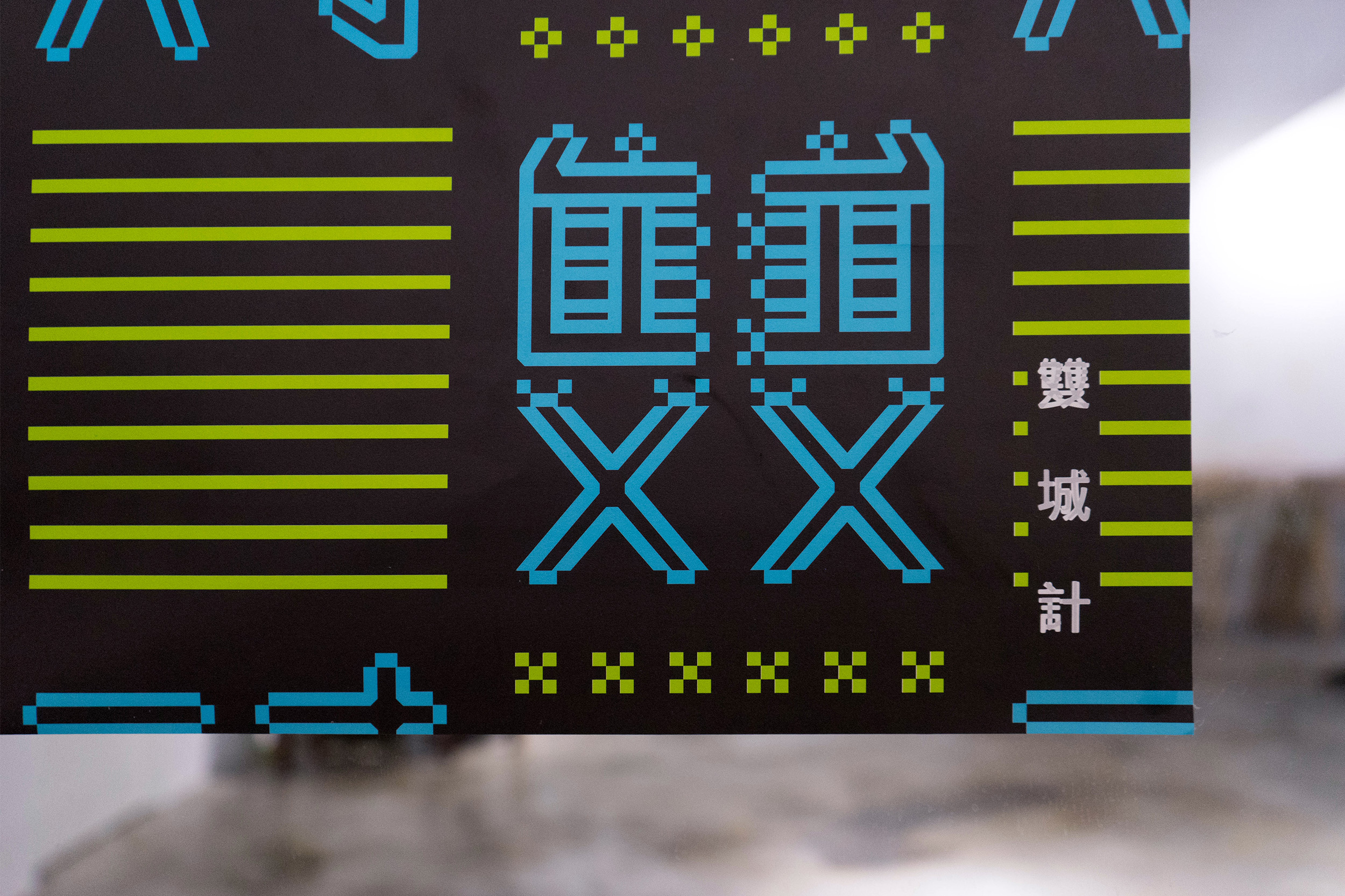
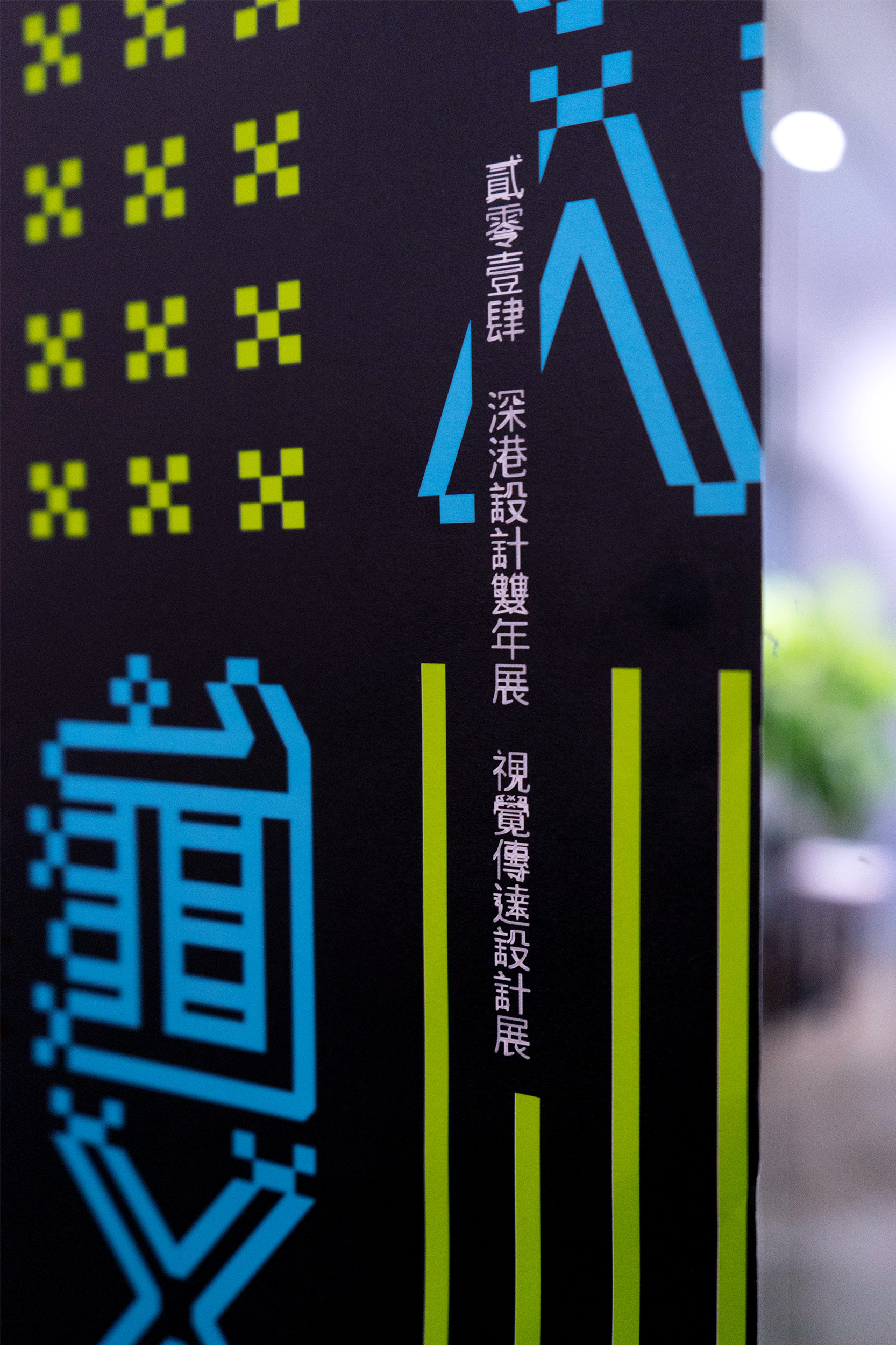
We were invited to participate the poster design of "雙城記", all designers to convey their impressions between Hong Kong and Shenzhen through the posters design.
I am born after 80's and experience the history of 1997, the rapid growth in China, living in Hong Kong under the policy of "One Country-Two Systems". In recent years, the society in Hong Kong hard to avoid the intervenue from China. Actually, the citizens in Hong Kong and Shenzhen arise the difference because of the discrepancy of life style, culture and systems between two cities.
To emphasis the diametric point, my design on font (雙)is using traditional Chinese character and (對) is using simplified character. Using the symbol "x" and "^v" to replace the difference font radicals.This design is using diametrically opposed point is to convey the differnce of two cities. The arrangement in the design looks clear and orderly but there is a counterpoint to each other.


